
There are only three resume formats
Everything marketed as a "format" is really a template. The format is what governs how your history is organised, and there are exactly three of those.
| Format | Organising principle | Who it suits | Verdict |
|---|---|---|---|
| Reverse-chronological | Jobs newest first, each dated with bullets | Anyone with a broadly continuous history in or near their target field | Default for ~85% of applicants |
| Hybrid / combination | Skills and relevant-project block above a full dated history | Career changers, returners, portfolio-based work | Use deliberately |
| Functional | Grouped by skill area; employment history minimised or undated | Almost nobody | Avoid |
Reverse-chronological: the default
Your most recent role first, then backwards. Each entry carries a job title, employer, location and dates, followed by achievement bullets.
It wins for boring, structural reasons. Recruiters have read thousands of them, so they can find what they need without effort. Text extraction handles it reliably because the field order is predictable. And duration filters — "3+ years experience" — can actually compute your experience from consistent dates, which is the mechanism by which you appear in a shortlist at all.
It also displays the thing employers care most about and that no other format shows well: progression. A reader can see you moved from analyst to senior analyst to lead in six years without you claiming anything.
Short stints, contract work and agency assignments do not require abandoning chronology. Group contract roles under the agency as one employer with assignments as sub-entries, and label career breaks with dates. You keep the format recruiters trust while removing the questions that make a patchy history look worse than it is.
Hybrid: for when relevance and recency disagree
A hybrid resume opens with a substantial block — a categorised skills section, and often two or three relevant projects — and then presents the complete, dated employment history underneath.
The point is sequencing, not concealment. If you are an operations manager moving into data analytics, your most recent job title argues against you while your actual skills argue for you. A hybrid puts the skills first and the dates immediately after, so a recruiter sees relevance in the top third and can still verify the timeline.
Use it when: you are changing career, returning after a break of a year or more, your relevant work is freelance or project-based, or your job titles badly understate what you actually did. Keep every date visible, keep the history complete, and make sure the skills block is specific rather than a soft-skill word cloud.
Functional: why it does not work
A functional resume groups your accomplishments under skill headings — "Project Management", "Client Relations" — and demotes employment to a bare list, sometimes without dates.
Two problems, both fatal. Recruiters recognise the format instantly and read it as an attempt to hide something, so it triggers exactly the scrutiny you were trying to avoid. And systems that filter on years of experience cannot compute duration without per-role dates, so you fail requirement filters silently.
If your instinct is reaching for a functional format, the underlying problem is usually a gap, a short stint or a title mismatch. All three are better solved with a labelled gap, grouped contracts, or a clarified title in a hybrid layout.
How to choose, in three questions
- Is your most recent role in or adjacent to the field you are applying to? Yes → reverse-chronological. Done.
- No — but do you have concrete, recent evidence of the new field (projects, a qualification, relevant work inside your old job)? Yes → hybrid.
- Neither? Then the format is not your problem. Build the evidence first: one deployed project, one certification, or one piece of work in your current role that uses the new skill. A layout cannot substitute for it.
Section order by career stage
Within any format, order is a ranking of your own evidence — strongest first.
| Stage | Order |
|---|---|
| Student / new graduate | Contact → Summary → Skills → Education → Projects → Internships → Activities |
| 2–10 years | Contact → Summary → Skills → Work experience → Education → Certifications |
| 10+ years | Contact → Summary → Skills → Work experience → Education → Boards, publications, speaking |
| Regulated field (nursing, teaching, law, accounting) | Contact → Summary → Licensure & certifications → Experience → Skills → Education |
| Career changer | Contact → Summary → Relevant skills → Relevant projects → Full work history → Education & retraining |
| Academic | Contact → Research statement → Education → Appointments → Publications → Funding → Teaching → Service |
Page setup: margins, fonts, spacing
None of this is where you should express yourself, and all of it affects whether your resume gets read.
| Element | Use | Avoid |
|---|---|---|
| Columns | One | Two columns, sidebars, text boxes |
| Margins | 1.5–2.5 cm on all sides | Under 1.2 cm — it reads as cramped and can clip on print |
| Body type | 10–12 pt | Under 10 pt, or over 12 pt to fill space |
| Name | 14–20 pt, largest text on the page | All-caps at 28 pt |
| Typeface | Inter, Calibri, Helvetica, Arial, Georgia, Garamond, Source Sans | Decorative, condensed, ultra-light or script faces |
| Line spacing | 1.15–1.5 | Single spacing with no gaps between sections |
| Bullets | Standard round or square | Icon-font glyphs, emoji, arrows |
| Colour | One accent for headings and rules | Coloured body text, dark page backgrounds |
| Dates | One consistent format, e.g. 03/2023 – Present | Mixing “2023-24” with “March 2024 to now” |
Two things people underestimate. White space is functional — it is what makes a page skimmable in ten seconds, and a resume that looks effortful to read gets less attention, not more. And alignment consistency matters more than any font choice: if dates are right-aligned in one role and inline in the next, the whole document reads as careless.
How long should it be
One page for students, new graduates and anyone under roughly ten years of relevant experience. Two pages for established professionals. Longer only where the content genuinely demands it: academic CVs, clinical roles with licences and rotations, senior technical roles with substantial architecture ownership.
Within that, the ratio matters more than the page count. Three to five bullets on your current role, two or three on the previous one, one or two on anything older than five years, and a single line for roles from more than fifteen years ago in an unrelated field. If you are over length, cut old roles and duty-style bullets — not margins and font size.
File type and naming
Export a text-based PDF. It parses everywhere and it renders exactly as you designed it, which DOCX does not guarantee across machines. Use DOCX only when the posting asks for it or a legacy portal refuses PDF.
The genuinely broken option is a scanned or image-only PDF — a photograph of a printed resume, or a design tool export flattened to a single image. There is no text layer, so unless the employer runs OCR, the parse result is blank.
Name it Firstname-Lastname-Role.pdf. Recruiters download dozens of attachments into one folder, and resume_final_v7(2).pdf is an unforced error.


Country differences that actually matter
| Market | Photo | Typical length | Notes |
|---|---|---|---|
| US | No | 1–2 pages | No date of birth, marital status or photo. City and state only, no street address. |
| UK / Ireland | No | 2 pages | “CV” means the same document. Right-to-work status is asked on the form, not the CV. |
| Canada / Australia | No | 2–3 pages | Australia tolerates longer documents; selection criteria responses are common in the public sector. |
| India | Optional, often omitted | 1–2 pages | Percentage or CGPA is expected for freshers; a declaration line is a common convention. |
| Germany / Austria / Switzerland | Common | 1–2 pages plus attachments | Tabular CV with a photo is conventional; certificates are often attached. |
| France / Spain / Italy | Common | 1–2 pages | Photo is normal; language proficiency levels are expected. |
| Japan | Yes | Set format | Standardised rirekisho forms are used; follow the employer's template exactly. |
What does not change anywhere: single column, achievement bullets with results, consistent dates, and conventional section headings. Adjust the wrapper, not the substance.
Templates by format
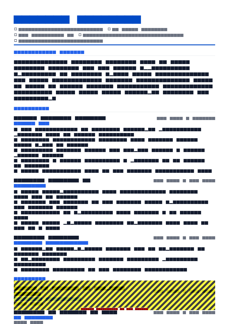
ATS Pro resume template
If you want the format decision made for you: ATS Pro is reverse-chronological, single column, conventional headings, and the highest-parsing layout in the library. It is the right default for anything you upload to an application portal.
Use this template in NextCV| Template | ATS score | Price | Best for |
|---|---|---|---|
| ATS Pro | 98 | Free | Reverse-chronological, maximum parsing safety — the safest general-purpose choice |
| Pure White | 95 | Free | Reverse-chronological, minimal and typography-led for experienced professionals |
| Executive Classic | 90 | Free | Reverse-chronological for senior and executive histories |
| Skills Based | 85 | Free | Hybrid — competencies lead, full dated history beneath |
| Competency Groups | 82 | Premium | Hybrid with grouped competency clusters |
| Sidebar Pro | 87 | Premium | Two-column design — email and portfolio use, not portal uploads |
The pattern in those numbers is not a coincidence: single-column, conventional layouts score in the 90s, and the more a design fragments the reading order, the further the score falls. Full library at 29 resume templates.
Format checklist
- Reverse-chronological unless you have a specific reason for hybrid
- Single column, no sidebars, no text boxes
- Nothing in the page header or footer region
- Margins 1.5–2.5 cm; body text 10–12 pt; one typeface
- Dates in one format throughout, every role dated
- Conventional section headings
- Section order matches your career stage
- One page under ten years, two pages after
- Exported as a text-based PDF, named for a human
- Country conventions checked for the market you are applying to
Frequently asked questions
What is the best resume format in 2026?
Reverse-chronological, single column. It is what recruiters expect, what text extraction handles most reliably, and what makes career progression readable in a five-second skim.
The exception is a genuine career change or a return after a long break, where a hybrid format — a substantial skills block above a full dated history — presents your relevance better without hiding anything.
Is a two-column resume format bad?
For anything you upload to an application portal, yes. Text extraction reads in document order, so a sidebar gets interleaved with your experience and produces lines like "Skills Senior Engineer Python Acme Corp 2022".
Keep a single-column version as your application document. If you want a designed two-column version for your own website or to email a hiring manager directly, maintain it as a separate file.
What font and size should a resume use?
A common, well-hinted typeface at 10–12 pt for body text and 14–20 pt for your name. Inter, Calibri, Helvetica, Arial, Georgia, Garamond and Source Sans are all safe. One typeface throughout, two at most.
Avoid anything decorative, condensed or ultra-light. If a font is not installed on the reader's machine and is not embedded in the PDF, substitution can reflow your entire layout.
Should a resume be PDF or Word?
A text-based PDF by default: every mainstream recruiting system reads it, and it renders identically to what you exported. Send DOCX only when the posting explicitly asks for Word or when an older portal rejects PDFs.
Never send a scanned or image-only PDF. It contains no extractable text, so unless the employer runs OCR your resume parses as an empty document.
How many pages should a resume be?
One page up to roughly ten years of relevant experience, two pages beyond that. Academic CVs, clinical roles and senior technical positions legitimately run longer because publications, licences and architecture ownership are the qualification.
The failure mode to avoid is compressing two pages into one with 8 pt type and 1 cm margins. Recruiters skip dense pages.
Do resume formats differ by country?
Yes, in three ways: personal details, length, and whether a photo is expected. The US, UK, Canada, Australia and Ireland want no photo, no date of birth and one to two pages. Much of continental Europe accepts a photo and a longer CV. India commonly includes a percentage or CGPA and, for freshers, a declaration line.
The structure and the achievement-based bullets stay the same everywhere. Only the surrounding conventions change.
NextCV Editorial
NextCV is an AI resume builder by Empire Softtech. We publish the same guidance our in-app ATS analyser is built on — seven weighted sections, 29 templates scored from 72 to 98, and no formatting advice we would not follow ourselves.